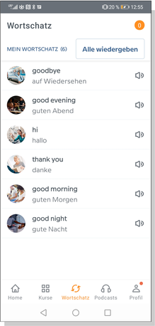
Vocapp
I created a responsive web application, made to learn new words with games and flash cards.
The design process includes competitor analysis, user persona, and low fidelity prototypes.
Tools
Pen & Paper
Adobe XD
InDesign
Zoom
Illustrator
Photoshop
Marvel
Competitor Analysis
Because I know little about e-learning and language education, I dived into research and ran a competitive analysis to understand more about this field. Studying the competitors helped me form the overall product strategy and discover opportunities.
I examined three competitors:
1. “Babbel”, the market leader in E-learning
2. “Leo” a popular dictionary website well-known for its community and forum
3. “Memorion” an app I stumbled upon because of its high ratings and recommendations.
1. Babbel
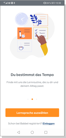
Onboarding
Vocabulary
Learning Methods
PRO
- State-of-the-art onboarding
- Questioning of Age and Learning Purpose
- Quick, smooth registration
- 7-day free trial
- 5 learning methods to choose from
- Small learning units
CON
- Mandatory to put down billing credit card or paypal account during registration process
- No community
- Costs after 7-day trial: 6,95 - 8,95 Euro mtly
- Too entertaining
Conclusion:
Babbel is a highly professional application. I appreciate the app asking its users about their goals, so the learning method and intensity can be adjusted. It's easy to navigate, looks fresh and
inviting, and is entertaining because different learning methods are laid out for the user.
I have slight doubts if the app can convince as a learning app and not drift off to entertainment. Unfortunately the app is not free although the pricing is moderate.
The biggest pain point for me is the registration process with mandatory credit card details, even for the free 7-day trial.
2. Leo
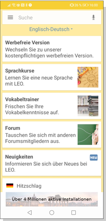
Start
Vocabulary
Learning Methods
PRO
- User-based dictionary included
- Different learning modes
- Phrases and expressions can be added too
- Audio for pronunciation
- Adding the word you looked up in the Leo-dictionary to your stack of flash cards
- Ready-to-use-stack of words available
- Simple app with 3 core functions (community, dictionary and training) for several languages
- Free of cost
- Community and Forum
CON
- No onboarding or explaination of the app
- Redirection to website for registration
- Special courses are chargeable
- No “back” button
- Bad recognition of typed in words (capitals are marked as mistakes)
- Out-dated, unpolished UI Design
- Complicated interface with folder structure
- Advertising
Conclusion:
Leo is well-known for its dictionary and forum. I visit the website often when I am searching for an appropriate translation, especially phrases and sayings.
Sadly, the application is confusing and could use improvements. The navigation is rough, the UI feels out-dated and unpolished. It reminds me of a Windows user interface with its folder-based
structure.
Using the app is frustrating and if it wasn’t for the dictionary and forum I wouldn’t use it. Leo has a strong community and if the user has a deeper interest in the language it’s highly
entertaining. This feature really adds value to the application.
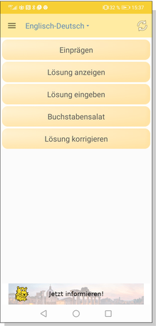
3. Memorion
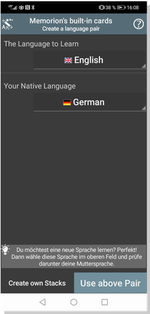
Start
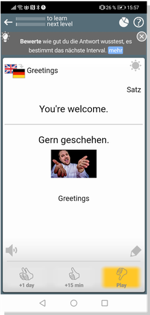
Flash Card
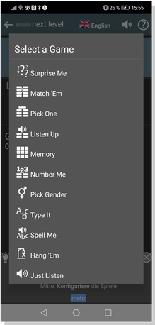
Learning Methods
PRO
- No registration
- 3 different levels: Beginner, Advanced, Expert
- Customisable flashcard stacks
- Easy to use with just one hand
- Audio and talk to speech
- Exact documentation of your progress
- Entertaining
- Detailed tutorial videos on Youtube
- Free
- No advertising
CON
- No onboarding
- Navigation in English only
- Redirection to website for registration
- Overwhelmingly packed app with too many features
- Time-consuming and to understand the app
- Very basic/technical design
- Feels complicated
Conclusion:
Memorion is like a Swiss Army pocket knife. The creator has put a lot of effort and thought into it. I enjoy trying out the different games, checking my progress and switching levels seamlessly.
The downside is that the app is overloaded and the UI design is pretty basic. It has so many features that it‘s difficult to completely understand it at a glance. For a full overview of the
features there are several tutorials available on YouTube. You could easily cut this app down to 4 or 5 individual ones. The application feels very technical and heavy due to the dark background.
Empathy Map

“I like convenient and simple learning
techniques.”
Jan, 50
Customer Service Manager

“Talking and conversation is the
key.”
Elena, 38
Lawyer

“I just wish I had more time.”
Carla, 47
Working Mom, Art Director
Carla, Mom and Art Director

Doing…
I am busy trying to keep job and family together.
I use flash cards to memorize new words.
I turn on BBC radio in the morning to listen to the English language
Thinking…
I wish I had more time to learn new words.
I think the best method to learn is a small learning group.
I think I’m a slow learner.
Feeling…
I’m always stressed and don’t have much time.
Using new words in my everyday life is a challenge.
It’s a great feeling doing something just for myself and not my job or family.
Jan, Customer Service Manager

Doing…
I spend a great deal of the day talking on the phone.
I learn through practice and repetition.
I like to use new technology.
Thinking…
I think it’s hard for me to find time.
I like easy solutions.
I think it will become easier to communicate without learning because of Google Translate and innovations to come.
Feeling…
I forget newly learned words easily.
I should bring up more time to learn new words.
Looking back and seeing your
progress is very uplifting.
Elena, Lawyer

Doing…
I just practice and try to use the new vocabulary as often as possible.
I watch series (e.g. Netflix) in a foreign language with subtitles to get a feel for it.
I use new words regularly.
Thinking…
I think being able to communicate in another language will make me look even more professional.
I think it’s a good way to connect with others fast.
I think it should be fun to learn new words.
Feeling…
I feel empowered when I can
use my new skills.
Learning new things is good for your brain.
I believe learning new words is easier if you aren't afraid of making mistakes.
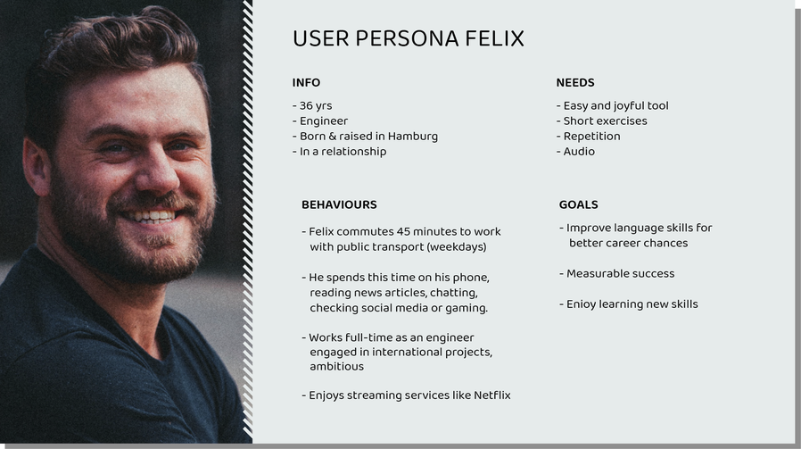
User Persona
User Persona Problem Statement
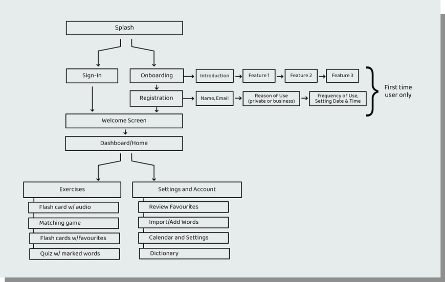
Sitemap
Design Process: Ideate
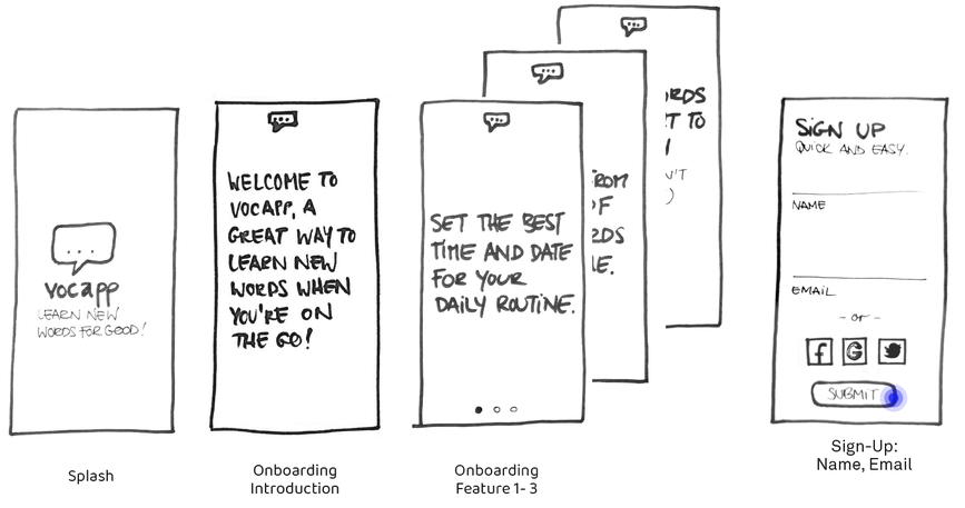
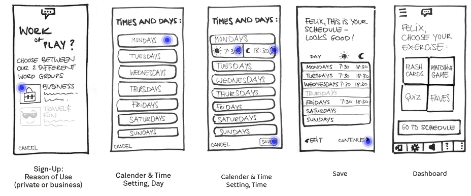
First Low Fidelity Prototype
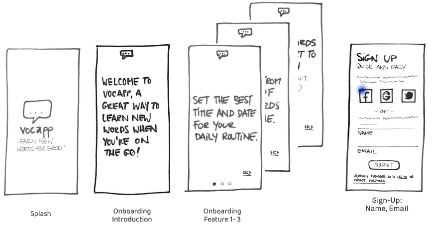
After research, interviewing, and creating user personas I sketched a low-fi prototype to get a better understanding of the application and locate possible pain points and errors.
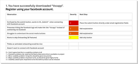
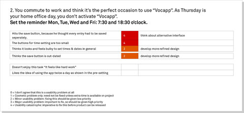
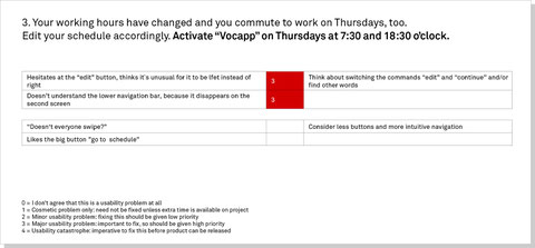
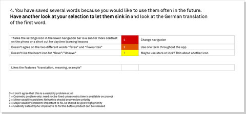
Usability Testing
I focused on the schedule settings and the general usage of the marked flash cards.
From mypoint of view, two features are important for this application:
1. A very good schedule and settings for time & date
2. Easy and entertaining to operate
Three participants with different backgrounds took part in a moderated user testing with the low fi protoype.
The test results show that the participants struggle with the navigation bar, weak or misleading phrases and user-unfriendly button sizes. The feedback went into the second prototype.
(Click on Image to enlarge)
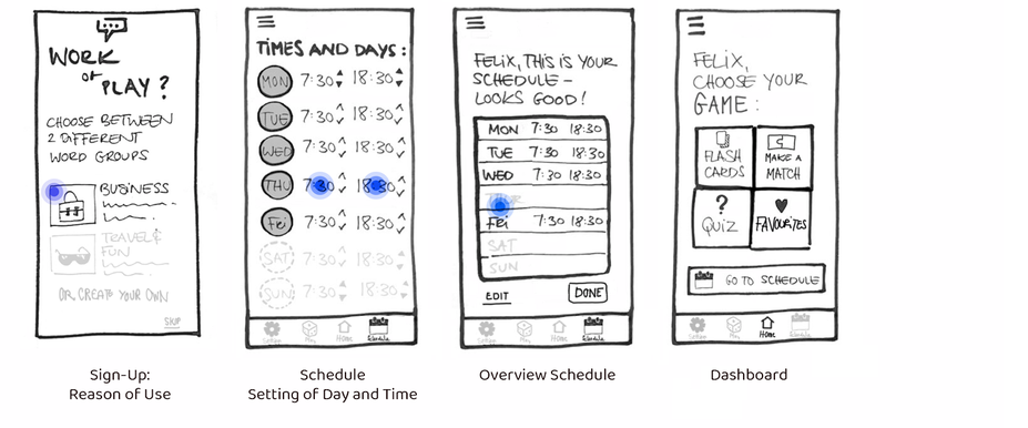
Revised Low Fidelity Prototype
Taking the results into consideration I made adjustments to the prototype to improve the overall interface. The first prototype navigation bar didn’t follow a clear hierarchy and had misplaced actions. I didn’t realise this issues at the time of making.
Improvements
- Skip Option during Onboarding
- Refined Sign-Up with more Options and explanatory text
- Edited Dashboard
- Redesigned Schedule Settings for better usability
- New Navigation
- Consistent wording