
Alphabet International
Website relaunch for Alphabet, an enterprise mobility provider. The company has an extensive service portfolio including rentable company cars, fleet management, e-mobility, and covering the last mile.
Sustainability, digitalisation, the desire for simplicity and comfort – new demands are being placed on mobility service providers in a highly competitive market.
Alphabet has a total of 14 country websites around the globe and in various languages. The English-language.com website serves as a blueprint and source of inspiration for the individual country sites, as they can set up their national website autonomously and according to their markets needs.
Disciplines: UX/UI Design
Role: Freelance UX/UI Designer
Client: track Agency
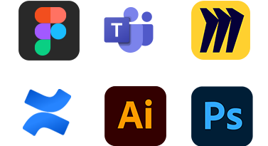
Tools
- Figma
- Teams
- Miro
- Confluence
- Adobe Illustrator
- Adobe Photoshop
Starting point
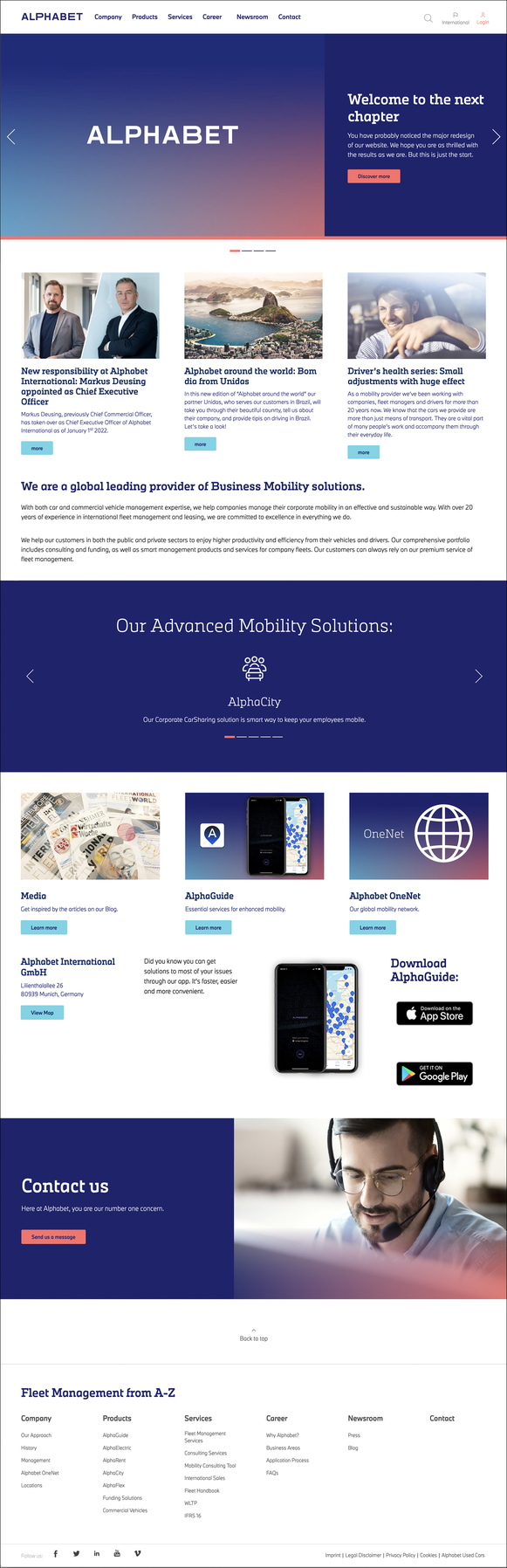
Previous Structure and Design
The company puts itself in the foreground, starting with the navigation with "Company", announcing new markets and personnel topics.
Alphabet has an self-reflective view and only appears downstream as a service provider.
Mission
We came to the conclusion to place the company´s services into the spotlight and provide detailed information in the field of mobility proving their expertise.
We want to simplify the navigation and focus on topics that are the most relevant to the users. Company news slides further down in the information hierarchy.
Moreover we aim to upgrade the joy of use by redesigning the user interface.
Shift of perspective.
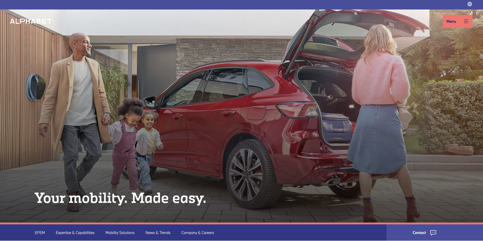
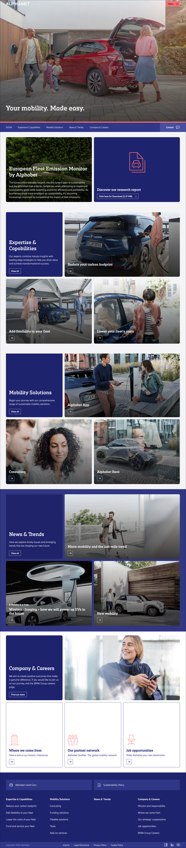
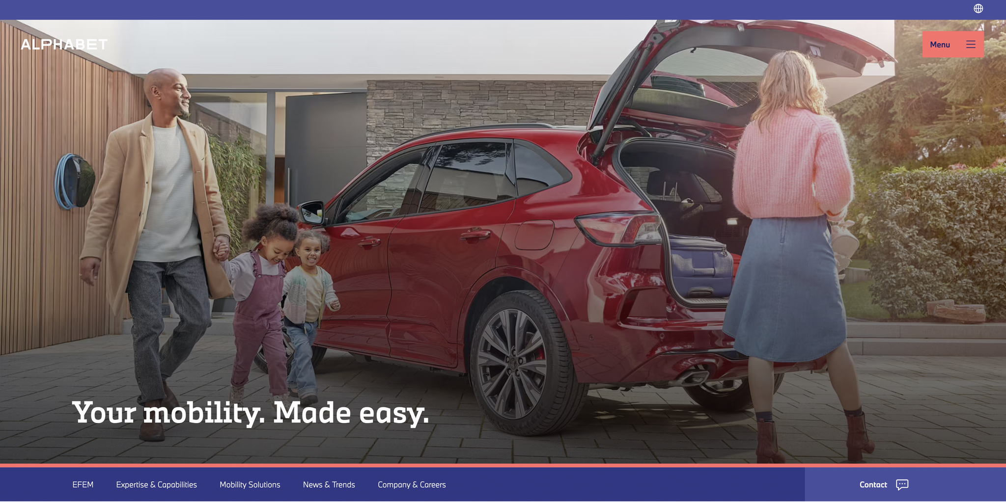
With the new information architecture, Alphabet appears first and foremost as an innovative service provider focused on its customers and their needs.
The new "News & Trends" section offers informative studies and articles on hot topics of mobility: from "Smart Citie"s to "The Last Mile" and "Wireless Charging". We enrich the site and go beyond only displaying the product portfolio.
We introduce People & Culture on the homepage and establish the company as an employer, too.
UI Design
With the new corporate design at hand we expand and optmise the principles for digital applications.
Each individual alphabet country is empowered to autonomously build their own pages and adjust it to meet their specific markets needs. The English-language.com site serves as a reference
demonstrating the flexibility of the new widget components.
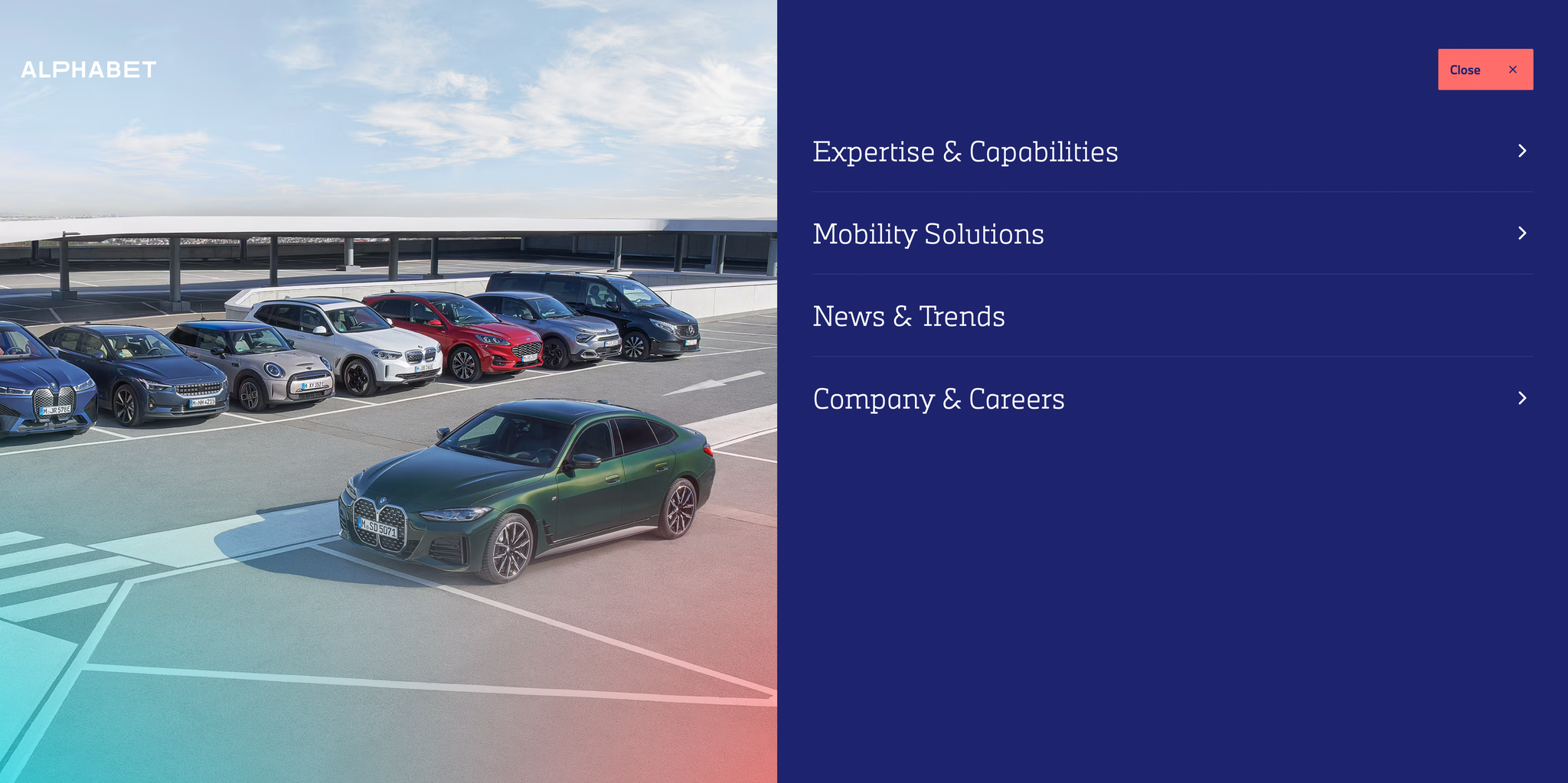
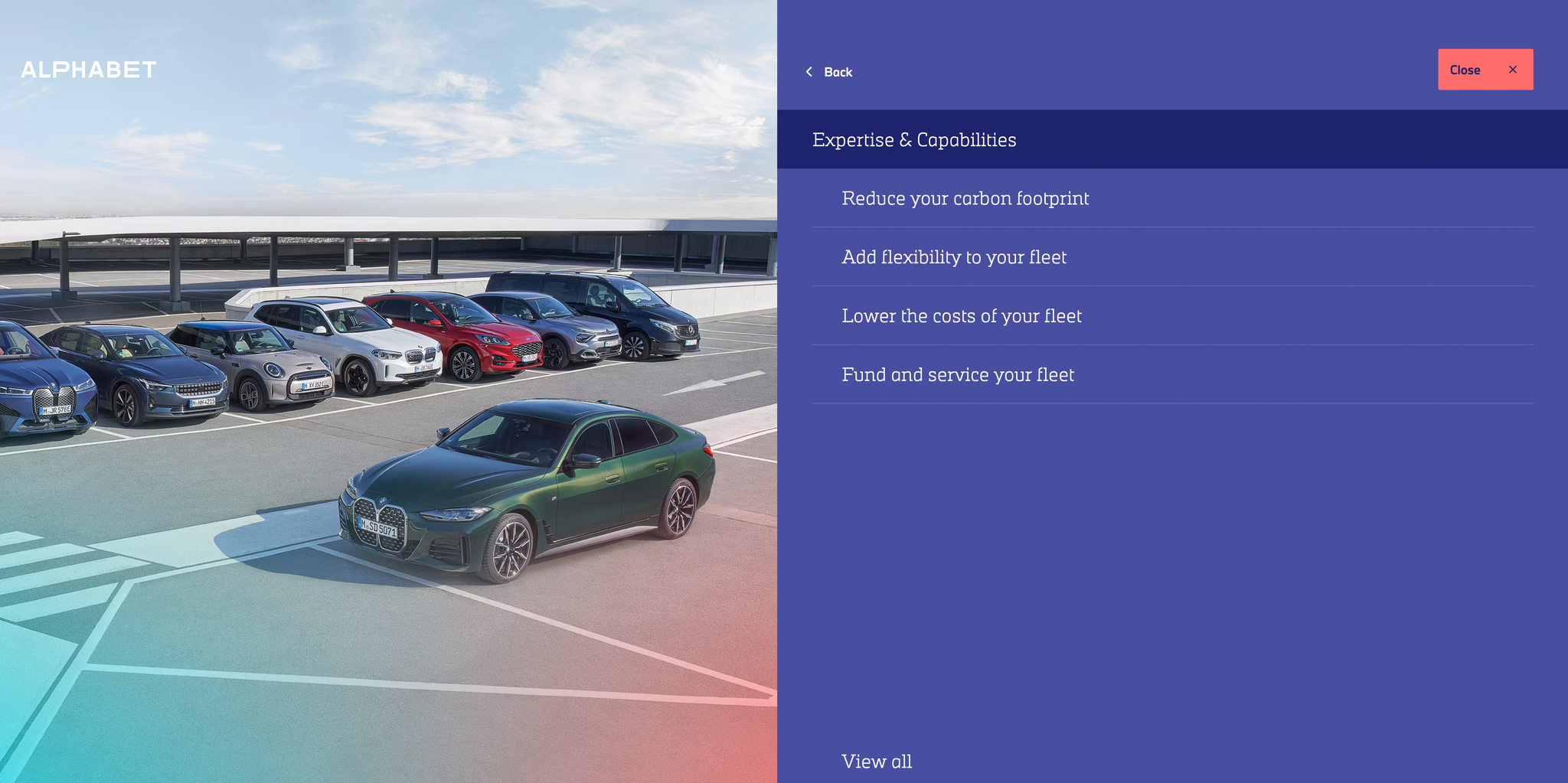
New Navigation and Progressive Disclosure
The navigation was created to ensure users find the desired information by using progressive disclosure. Each click goes further into detail of the chosen category, revealing information in smaller bites, one after another.
I feel honoured to have worked on this demanding project. Every team member strived to create a significant change and a user-centred experience. I gained many insights and learned enormously being part of this massive project.
