
ezee Vegan Application
Introduction
Tools
- Pen, Paper & Post-Its
- Adobe XD
- Usability Hub
- Optimal Workshop
- Marvel Prototyping App
- Google Surveys
- Zoom
- Adobe Illustrator
- Adobe Photoshop
- Adobe InDesign
Design Thinking Process
The Design Thinking Process is known not to be linear.
I have prepared this case in a linear way so that users can find content quickly.

Empathise
Learning about the audience

Define
Identifiying the users’ needs

Ideate
Generating Ideas for design

Prototype
Turning ideas into concrete examples

Test
Evaluation of the Design
Design Process: 1. Empathise
Business Hypothesis
Executive Summary
The app features information about vegan nutrition and vegan cooking. Premium members can also contact a qualified expert via video call for first hand advice.
In Germany the number of vegans climbed from 0.8 million in 2016 to 1.41 million in 2021.
Hypothesis Statement
The users need a way to ask anything about vegan nutrition without endless searching because they want qualified answers from experts and cooking inspiration.
We will know this to be true when we see a high number of downloads and many users asking our experts for advice.
Competitive Analysis
Cooking:

Survey
Conducting an online survey helped to find out if the idea is welcomed by the target audience. By posing general questions I got a first glimpse of the needs and goals.
The results are very reassuring: not only does the vast majority already have cooking applications (81%), they are also open to vegan nutrition (71%).

Google Survey Results
52%
Use a food app at
least once a week
71%
would try vegan
nutrition
75%
Cook 30 min
or more daily
Interviews
Based on the results from the first survey we go into detail by interviewing four candidates with different life styles and cooking habits – from omnivore interested in healthy eating to longtime vegan. The interviews were held using Zoom.
Insights
1. ezee Vegan Expert s
There is so much information about vegan eating and anyone new to this field are insecure and timid. Qualified experts with a cooking or nutritionist background are a must. We need to prove that our expert is trustworthy and professional.
Feature Idea: Showing easy recipes, giving advice and special cooking sessions can help to build up trust. It reduces the barrier of contacting a stranger.
2. Behaviour Phone & Apps
The interviewees have concerns when it comes to video calls. This is mainly due to lack of trust and insecurity of video calling a stranger.
Communicating through WhatsApp is more popular than Video Calls. The advantages are that good reception isn’t as crucial, you can leave Voice Messages and text while you're on the go.
Feature Idea: Let the user choose a communication channel by adding an additional chat function. Providing a “Call Back” function could make the video call more appealing.
3. The Interviewees
All show great interest in vegan eating and are willing to try it or already cook vegan. They often use Google when they look for a new recipe which can be very frustrating.
Their aim is to be proud of the meal they created, to have reassurance the time and effort they invested was worth it. The motivation level is high, with “cooking laziness” popping up every now
and then.
Feature Idea: Meal suggestions for a daily dose of inspiration. Additional online cooking sessions offer full guidance and include interaction. A friendly daily nudge to treat
yourself with a home-cooked vegan meal could also be useful.

“I’m ready to try everything new if it’s presented to me.”
Stefano, Interviewee

Design Process: Define
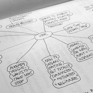
User Personas
Next step to create the app was to create user personas. I took following information into account:
1. Statistics from Statista and ProVeg Organistation
2. Google Survey results for basic information i.e. age, household size and cooking habits .
3. Interviews, especially the needs & goals, and fears I filtered from the dialogues.
The personas helped me develop the app throughout the process and keep my focus.
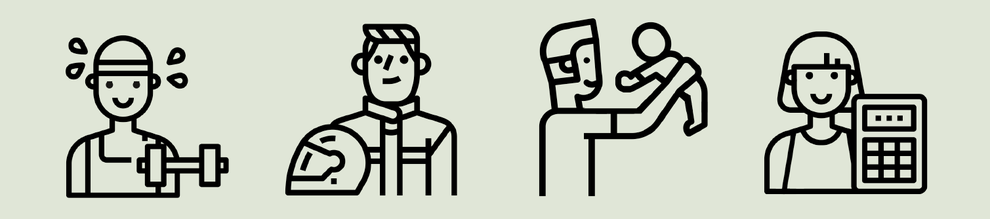
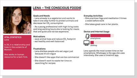
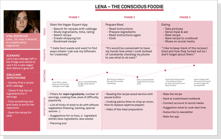
Lena, The Conscious Foodie
Lena is our main persona. Age, lifestyle, goals and needs completely fit to the apps aspect of vegan cooking. It is uncertain though that she will become a paying premium member.
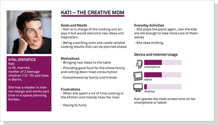
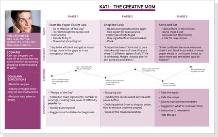
Kati, The Creative Mom
This persona focuses on the experts and video call function. She has the willingness and ability to spend money for the experts support.
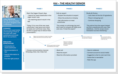
Kai, The Healthy Senior
This persona is health-conscious and focuses on the nutritional aspect. He also is willing and able to spend money for the experts support.

Click on Image to enlarge
User Journeys
To understand how customers interact with the service I created User Journeys and narrowed each one down to one major pain point and possible solution.
1. Lena, The Conscious Foodie
Pain Point: The recipe will turn out as a fail
Solution/Feature: Rating system
2. Kati, The Creative Mom
Pain Point: Her family won't like the meal
Solution/Feature: Rating system, Experts
3. Kai, The Healthy Senior
Pain Point: He feels intimidated by the huge variety at the supermarket
Solution/Feature: Expert Video Call
Click on Image to enlarge
Design Process: Define
Now the cycle begins.
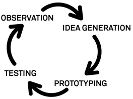
The next step after research is to create, test, observe and generate again and again to improve the application.
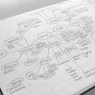
For me sketching is the best form of brainstorming. By visualising the application and creating mind maps I can spot weaknesses and connect loose ends.
User Flows
Based on these insights (and a pressure to move on to the next feature), I felt good enough to move forward and define three essential User Flows.
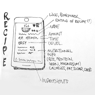
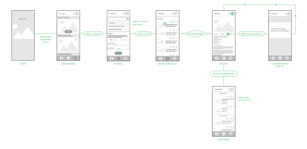
1. Search and Save Recipe
Presumably this will the most common action on the the app. It is essential that the user can search with ease and save a recipe for later.
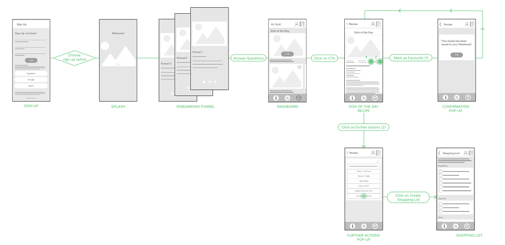
2. Register, Save Recipe, Create Shopping List
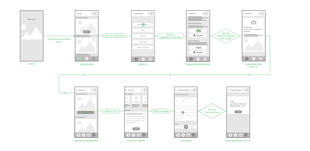
3. Become Premium Member, and Arrange Appointment for Video Call
From an economical point of view, signing up for Premium membership is tremendously important. The app relies on paying members to keep the service running.
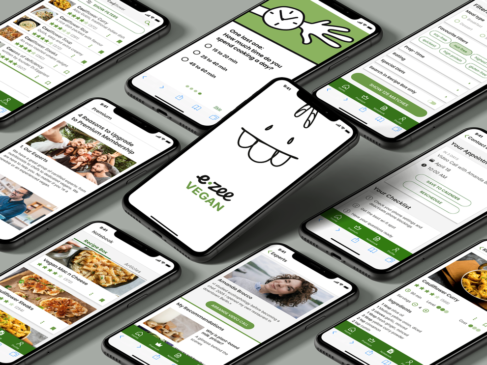
Design Process: Prototype
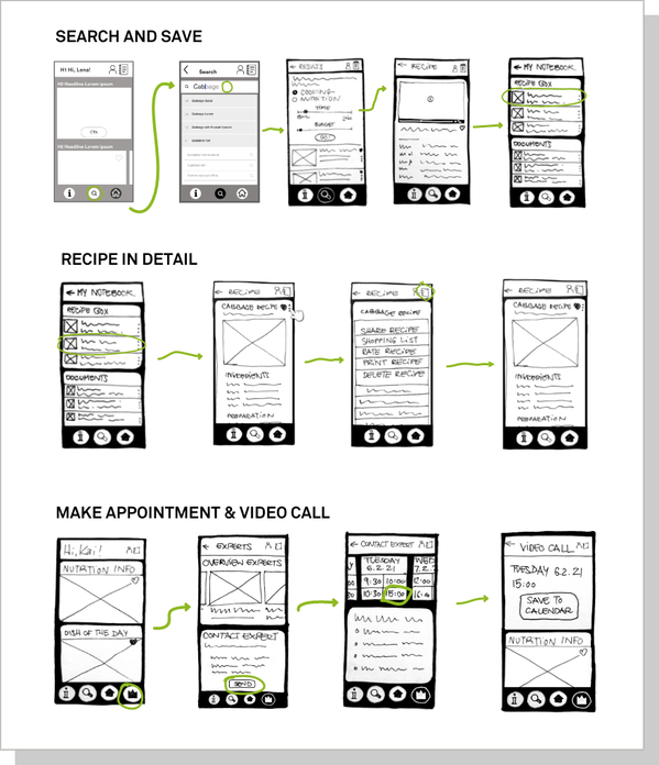
Low fidelity Prototype
After research, interviewing, creating user personas and stories I roughly visualise the app.
Design Process: Test
Usability Testing
With my mid fi prototype I conducted a moderated remote testing with six participants and the average duration was at 40 minutes. Each participant was asked to accomplish 3 tasks.
All were
successful and the overall feedback was very positive.
And some issues were uncovered, too.
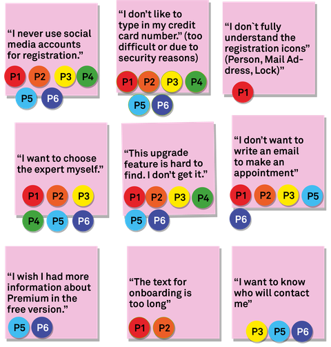
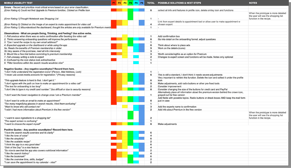
Affinity Map
Issues
The usability test revealed one main issue. The testers couldn’t figure out how to upgrade to the premium function. All six of them failed at the first try.
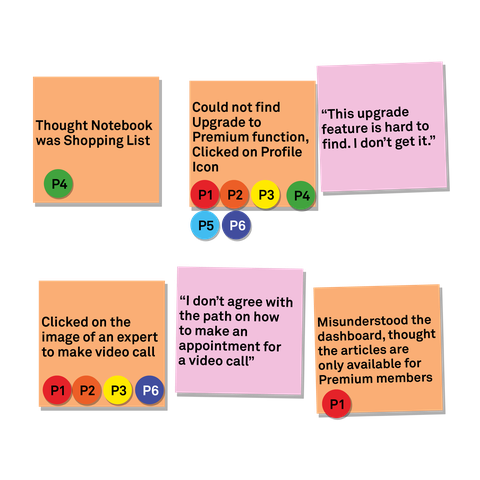
Negative Feedback
All participants wanted to freely choose their expert. They disagreed with the suggested path of first writing an email in order to find the ideal expert and then make an appointment.
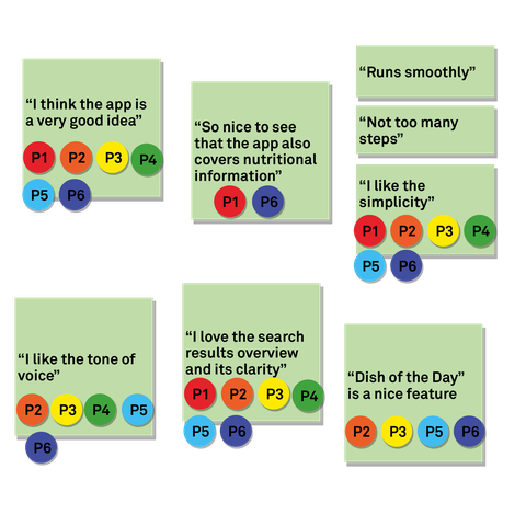
Positive Feedback
Overall the participants appreciated the concept of the app, its clarity and tone of voice.
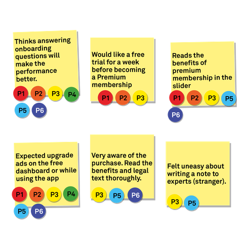
Behaviour and Attitude
The users welcomed the onboarding questions and rely on answering them to customise and improve the experience.
Some participants hestiate when it comes to paying for the service and suggest a free trial week.
Rainbow Spreadsheet
Rainbow sheets are ideal to order the feedback and prioritise my next steps. I can classify issues and pain points and think about solutions.
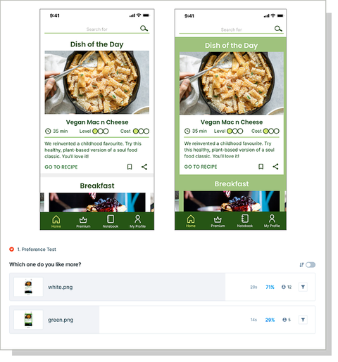
Preference Test
I admit that I lost my objectivity along the way and hesitated to make adjustments on the design.
With a preference test I received feedback from a bigger audience and the clear result ended in changing the green background to light grey.
UI Design
The mission of ezee Vegan is to simplify vegan eating and nutrition and to inspire people to explore all the possibilities. Using the app is of course easy and effortless.
The look and feel reflects this approach by using a handdrawn mascot, positive tone of voice. Some design choices were among the obvious i.e. choosing green (colour of nature and health). I added a set of modern sans serif fonts and authentic, state-of-the-art photography and icons for a vivid mix of fun and seriousness.
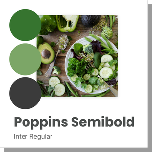
Colours, Fonts and Appeal

Mascot and Illustration-Style
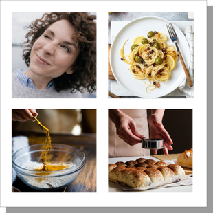
Imagery
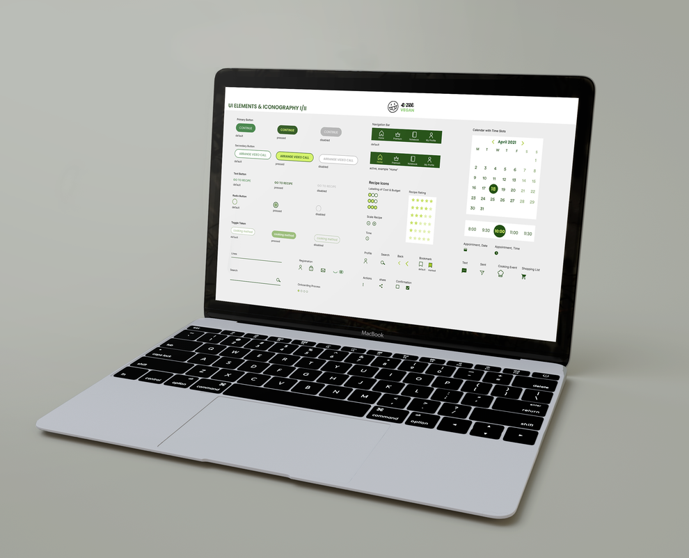
UI Design Elements
Design Process: Implement
Hi Fi Prototype

The Take Away
Throughout the process I revisited the brief along the way to check that I stay on track. The initial sitemap was adjusted as I was progressing and was a big help as soon as I began creating clickable prototypes.
Sticking to the motto “Fail often and early!“ was worthwile. I quickly created prototypes, tested them, and discovered weak spots.
After a few rounds I felt confident enough to move on to mid and high fidelity prototypes.
I enjoyed working and learning through every step, especially building the construction of the application made my heart jump.
